OUR WORK
Please view the work below shows a variation of logos, packaging, fonts, colour schemes, social media postings, and print media.
C O A T E D - P R E M I U M P A I N T M A N U F A C T U R E R
C O N C E P T :
Introducing COATED - LDN's finest paint manufacturing company. This brand was in need of a primary logo, secondary logo, and sub-marks. If you look closely you will be able to see the use of the 'E' and 'D' and how it has been reconstructed to give the impression of a paintbrush to tie in with the identity of this brand. The inclusion of a spiraled pattern and bright colour scheme captures the eye and adds variation, so that the consumer can see that it can be used for any home inside and out. Social media feeds, stories and highlights were also included to generate increased awareness online, while complimenting the aesthetic appeal that this brand encompasses.
B O X ' D - P R E M I U M G R A Z I N G C O M P A N Y
C O N C E P T :
BOX'D was created for the perfect luxury buyer who has a taste for the finest of food and loves holding events or hosting parties/small gatherings. The brand is a delivery service offering bite-sized pieces of cheese, crackers, fruits, crakcers, nuts, breads, meats, and of course a sweet treat. This brand includes a primary and secondary logo, as well as a pattern for packaging, and business cards. The colour scheme and the use of slighted darker tones help enrich the value of premium and it also adds a pop of highlight through the illustrated pattern. It also includes stickers and wrapping paper in order to enhance the customer's experience through premium value when ordering a grazing box.
D O U G H C R A Z Y - D O U G H N U T S H O P
C O N C E P T :
Dough Crazy - dough for it you know you want to. A fun filled doughnut brand full of colour and character. A primary logo, secondary logo and sub-mark was needed for a starting point to create the brand's identity. This was then followed by box packaging and stickers using elements of the logo and of course the signatue sprinkles that we all associate with when we think of doughnuts.
R I G B Y M O R R I S O N - F A C I L I T I E S M A N A G E M E N T C O N S U L T A N C Y
C O N C E P T :
Rigby Morrison wanted us to create a leaflet in order to generate awareness and increase engagement from consumers. The company already had branding in place such as their logo, colour scheme and font, so in order to create the leaflet this had to be implemented into the design. Using the company's website was benefical to incorporate current imagery and styling for the leaflet and working closely with Director, Daniel Matthews through 1:1 meetings and email communication enabled precision for their vision to come to life.

L O G O C O M P E T I T I O N
C O N C E P T :
Came runner - up in the in the Gloucestershire Sexual Violence Partnership Logo Competiton. The brief was to create a logo demonstrating the awareness of sexual harassment, and had to represent the 10 health and safety agencies that are part of the Sexual Violence Partnership Board in Gloucestershire, while also working in conjunction with the Glostakesastand logo. View images to understand the meaning behind the logo.
T H E S O A P C O. - B A R & L I Q U I D S O A P C O M P A N Y
C O N C E P T :
The Soap Co. a modern, vibrant and fun brand that sells bar and liquid soap. This features a primary, secondary and sub-mark logo and is complimented with terrazzo inspired packaging.
T H E H E M I N G W A Y - B O O K & C O F F E E S H O P
C O N C E P T :
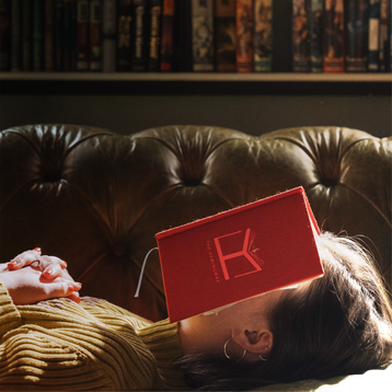
The Hemingway Book & Coffee Shop, a sleek, modern brand featuring a primary, secondary and sub-mark logo and also a coffee cup design, packaging for the books, loyalty cards, and a shop sign.
R A T E M Y P L A C E M E N T - S H O R T L I S T E D F O R F R O N T C O V E R
D E S I G N C O M P E T I T I O N
C O N C E P T :
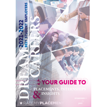
A priveledge to have been selected as 1 of 5 to be shortlisted for the Rate My Placement Front Cover Design Competition. This competition was directed towards any UK university student and the brief was to create a front cover for their 2021-2022 guide which was then judged by a panel including someone from the Adobe company. All shortlisted designs will be featured inside the new guide this September.
A L T E R E G O - H A I R D Y E B R A N D
C O N C E P T :
Alter Ego is a premium hair dye brand that needed a primary, secondary and sub-mark logos, along with a tagline ('Two Sides To Every Story'). The meaning behind the tagline meets the name of of the brand well as each individual’s life is a story, but is altered due to which personality they choose to show at that moment in time. A packaging design was also created to help bring the representation of the brand and its premium quality to life.

F A I T H - S K I N C A R E B R A N D
C O N C E P T :
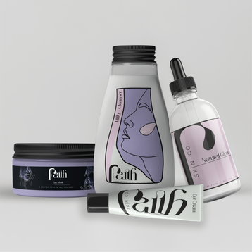
Faith provides the necessities of reliant and trustworthy skincare products, while also providing a bold and stylish look to compliment the brand. This is demonstrated through the logo variations, pattern making for the packaging, the loyalty cards, product mock-ups, social media templates, imagery, and the GIFS.
B L E N D E D - J U I C E S & S M O O T H I E S B R A N D
C O N C E P T :
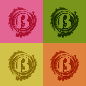
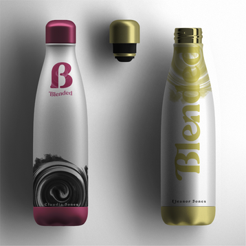
Blended is a 100% natural juice and smoothie brand for the consumer who is always on the go! The bold, bright colour scheme was used to compliment the array of ingredients used to make a juice or smoothie. A primary, secondary and sub-mark logos were formed to bring character and identity to the brand. Product mock-ups were made, and in particular a re-usable bottle to emphasise that it is a sustainable brand and can also be personalised to enhance the customers' experience. Social media templates and a website homescreen layout were also designed to bring together the other branding created for a strong visual brand identity.


